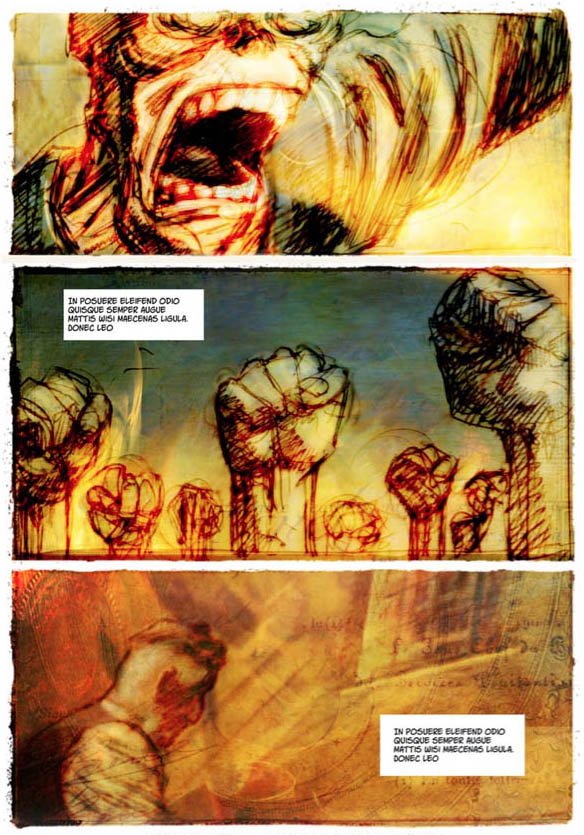
Page 15 is from of a scene I did earlier as part of the initial Kickstarter campaign. This is were I settled on the style and realized this is what was needed for Maelstrom. But how about the process that brought me there?
I haven’t kept the preparatory material for page 15. Since I had not yet come up with the idea for a blog explaining the creative process of the comic, I didn’t need to.
But that’s the perfect opportunity to show the trials and errors, the embryo of Maelstrom.
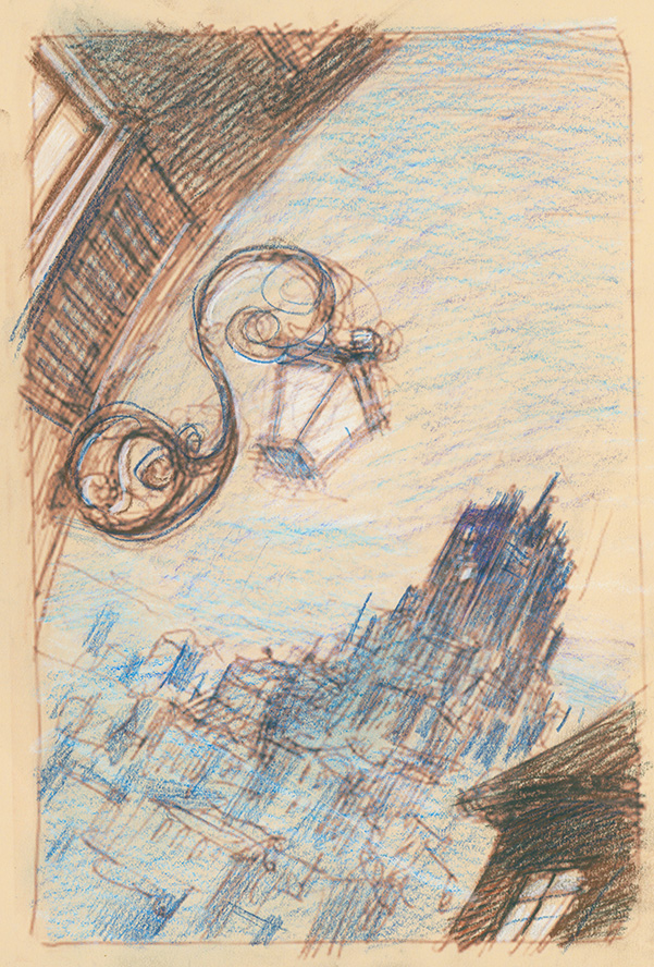
Here are a few examples of me trying to make a traditional / Photoshop hybrid. I first started from a Moleskin notebook sketch (3.5″ X 5.5″ or 9cm X 14cm) and printed it larger on a letter size, tan paper. I added some coloured pencil to give it a bit of texture…
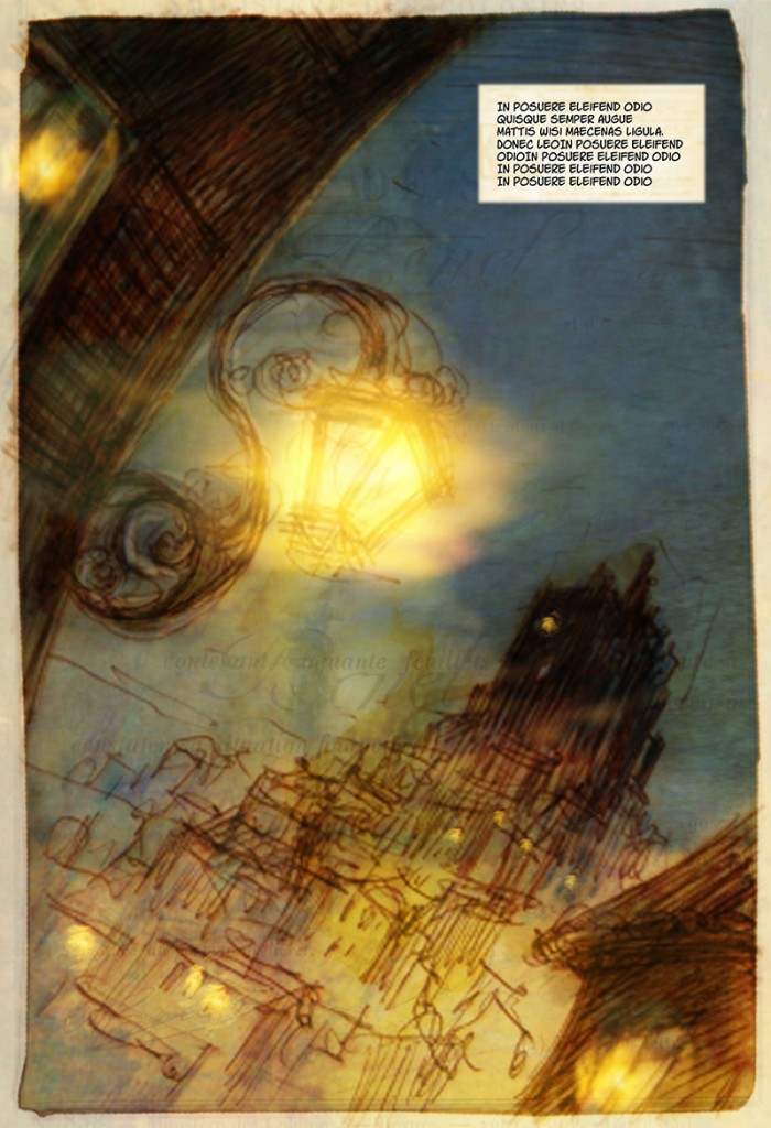
And then, following the steps explained in the VIP post for page 14, I added Photoshop layers. The text is what we call Lorem Ipsum, which is just dummy text that has been used by the typesetting industry for ages. It’s just fake blocks of text that won’t distract anyone by using readable content.
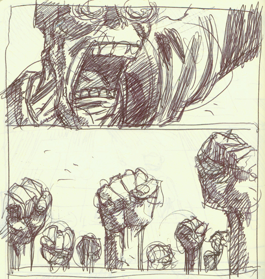
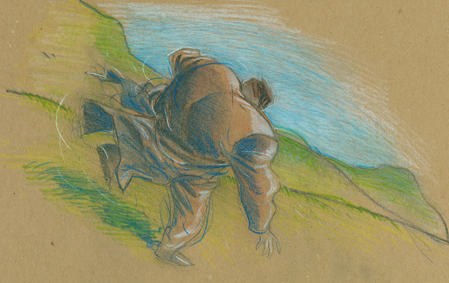
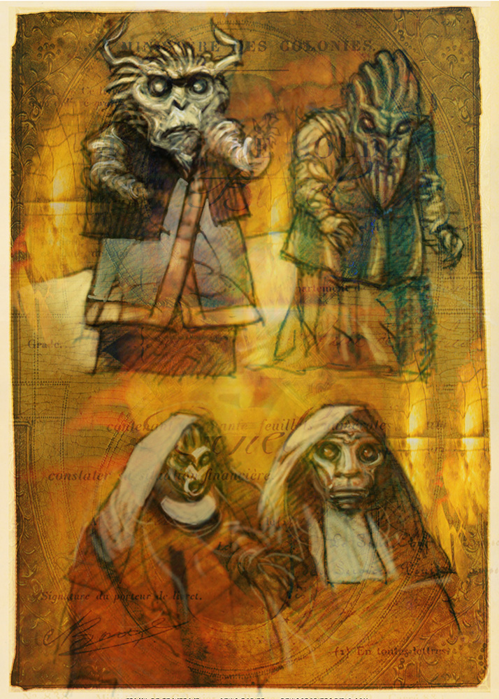
Again, the Moleskin sketch done in ballpoint pen…
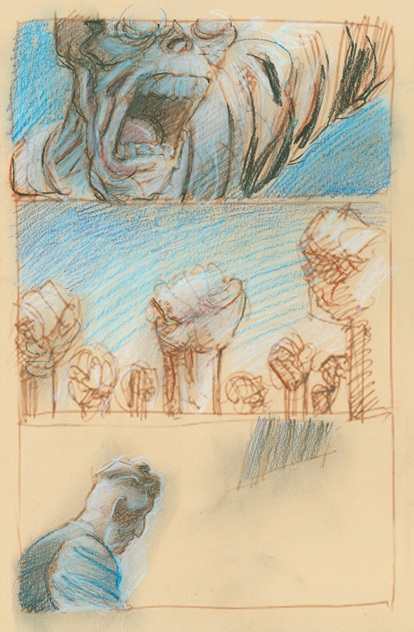
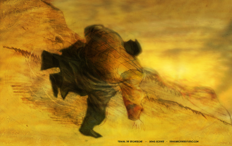
Blown up to letter size with the line turned sepia…
And Photoshop…
I may still use this style in a future project, but for Maelstrom, the concept called for something more traditional.
Cheers,
Denis
—


